
A KPI dashboard for a small business is one screen showing the 4 to 7 numbers you need to run the company, pulled automatically from the systems you already use. It replaces the habit of digging through QuickBooks, your bank app, and a Stripe login just to answer "how are we doing this week?"
You have five practical routes to get one: a full business intelligence platform like Microsoft Power BI or Tableau, a small-business-focused tool like Databox or Klipfolio, a free build in Google Looker Studio, an all-in-one performance suite like Scoro, or a managed service where a bookkeeping partner such as Mygappro builds and maintains it for you. The U.S. Chamber of Commerce recommends choosing KPIs based on your specific business objectives rather than copying a generic list.
Your first move, regardless of tool: pick your One Metric That Matters, then add three or four supporting numbers around it.
- Tight on cash or new: cash runway plus weekly revenue, in a free Looker Studio build.
- Growing and juggling tools: Databox or Klipfolio for prebuilt small-business KPI packs.
- Data-heavy or multi-location: Power BI or Tableau for deeper analytics.
- No time or appetite for spreadsheets: a managed dashboard built by a bookkeeping partner.
Table of Contents
- Best KPI Dashboards for Small Business: At-a-Glance Comparison
- How Do You Choose the Right KPI Dashboard?
- Which KPIs Should Small Businesses Track by Function?
- How to Build a KPI Dashboard Step by Step
- Where to Find KPI Dashboard Examples and Free Templates
- What Design Choices Make a Dashboard Actually Useful?
- Which Systems Should Your Dashboard Connect To?
- What Does a KPI Dashboard Cost and How Long Does Setup Take?
- How Was This Shortlist Chosen?
- When Should You DIY Your Dashboard vs. Hire a Partner?
- Sources
- FAQ
Best KPI Dashboards for Small Business: At-a-Glance Comparison
Every tool on this shortlist gives you at-a-glance visual feedback on how your business is tracking against its goals, but they get there in very different ways.
- Microsoft Power BI: strong for owners already in the Microsoft ecosystem who want deep, customizable reporting and don't mind a learning curve.
- Tableau: built for visual polish and best-practice guidance on presenting KPIs in context rather than raw numbers with no comparison point.
- Qlik: leans hardest into finance, letting teams explore unified, real-time data for forecasting, budgeting, and cost control.
- Databox: purpose-built for small businesses, with templates aimed at common small-business metrics and a much faster setup path than enterprise BI tools.
- Google Looker Studio: free, connects to Google Sheets and many third-party sources, and is the default starting point for DIY owners.
- Klipfolio: known for flexible KPI packs and connectors that suit agencies and services businesses tracking client metrics.
- Scoro: combines project, sales, and financial data in one workspace, which fits agencies and consultancies more than product-based businesses.
| Dimension | Enterprise BI (Power BI, Tableau, Qlik) | Small-business tools (Databox, Klipfolio) | Free DIY (Looker Studio) | All-in-one (Scoro) |
|---|---|---|---|---|
| Best for | Data-heavy, multi-location businesses | Growing businesses wanting fast setup | Solo owners, tight budgets | Agencies and project-based teams |
| Pricing shape | Paid tiers, often per user | Paid tiers with free trial | Free | Paid tiers |
| Ease of setup | Consultant-often-required | Self-serve | Self-serve, some learning curve | Self-serve to moderate |
| Integrations | Many, enterprise-grade | Many, small-business-focused | Many via connectors | Moderate, project/finance-focused |
| Refresh frequency | Real-time to daily | Real-time to daily | Depends on connector | Real-time to daily |
| Templates/KPI packs | Few prebuilt, high customization | Many prebuilt packs | Many community templates | Some prebuilt |
| Customization/analytics | High | Medium | Medium | Medium |
| Mobile & sharing | Strong | Strong | Moderate | Moderate |
| Learning curve/support | Steep, strong support docs | Low, guided onboarding | Low, community support | Low to moderate |
The trade-off is consistent across the board: more customization means more setup time and often a dedicated person to maintain it.
How Do You Choose the Right KPI Dashboard?
Start with your data sources, not the dashboard's feature list. If a tool can't connect directly to QuickBooks, Stripe, or your point-of-sale system, you'll spend more time exporting CSVs than looking at insights.
Run through these criteria before committing to anything:
- Connectors: does it plug into your accounting, payments, and payroll systems natively?
- Automation vs. manual entry: automatic pulls remove the manual-entry risk that quietly corrupts small-business numbers.
- Pricing model: monthly subscription, per-user fee, or one-time build cost?
- Setup time: hours, days, or weeks before you trust the numbers?
- Security: encryption in transit and clear access controls.
- Templates: does it ship with KPI packs for your industry, or do you start blank?
On a demo or trial, ask directly: "Can I export raw data if I leave?" and "What happens when my accounting software updates its API?" Red flags include tools that require a full-time analyst to maintain, hide the underlying raw numbers behind proprietary visualizations, lack any QuickBooks or Stripe connector, or lock you into a long-term contract before you've seen a working dashboard.
Pro Tip: Prioritize the connection to your accounting and payments systems over every other feature. A beautiful dashboard fed by stale, manually typed numbers is worse than no dashboard at all.
Pro Tip: Start with a 4 to 7 KPI weekly dashboard and one fixed habit, like reviewing it every Monday morning with coffee, before adding a single extra metric.
Which KPIs Should Small Businesses Track by Function?
Your One Metric That Matters changes by stage. A pre-revenue business should watch cash runway above everything else. A business scaling sales should watch customer acquisition cost against lifetime value. A mature service business should watch revenue per employee and repeat purchase rate. The U.S. Chamber lists more than thirty small-business KPIs across these functions, but you rarely need more than a handful active at once.
- Financial: cash runway (months of expenses covered), gross margin percent, accounts receivable aging.
- Sales: conversion rate, average deal size, sales cycle length.
- Marketing: customer acquisition cost (CAC), cost per lead, marketing-qualified leads.
- HR: revenue per employee, turnover rate, time-to-hire.
- Operations: inventory turnover, on-time delivery rate, capacity utilization.
- E-commerce: cart abandonment rate, repeat purchase rate, customer lifetime value (LTV).
| Metric | What it tells you | Where to pull it from |
|---|---|---|
| Cash runway | Months until cash runs out at current burn | Bank feed + accounting software |
| Gross margin % | How much each sale actually contributes after direct costs | Accounting software (QuickBooks) |
| CAC | Cost to acquire one new customer | Ad platforms + CRM |
| LTV | Total revenue expected from an average customer | CRM + accounting software |
| Repeat purchase rate | Percent of customers who buy again | POS or e-commerce platform |
| Revenue per employee | Efficiency of your team relative to output | Payroll + accounting software |
How to Build a KPI Dashboard Step by Step
Building a dashboard is less about software and more about sequencing. Skip a step and you'll end up rebuilding it in three months.
- Pick your KPIs. Choose one primary metric and three to six supporting ones. Resist the urge to track everything.
- Map source fields. Identify exactly which report or field in QuickBooks, your bank, or your CRM generates each number.
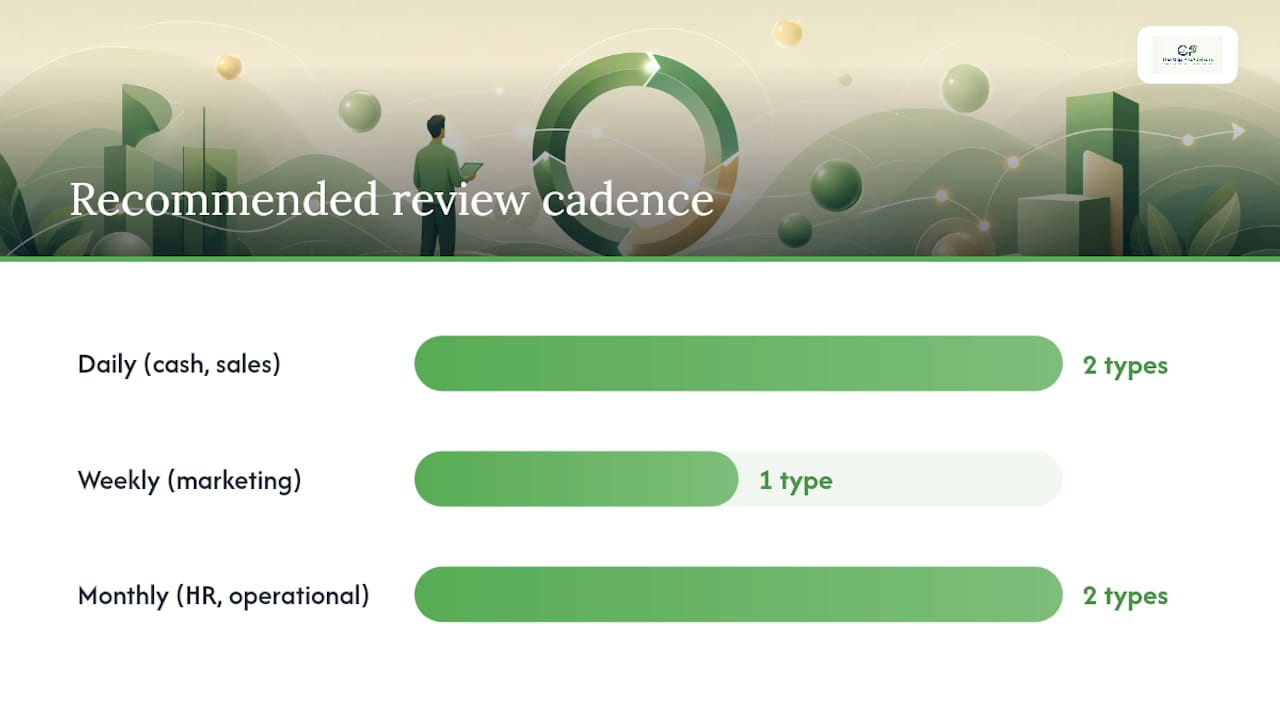
- Decide refresh cadence. Daily for cash and sales, weekly for marketing, monthly for HR and operational metrics.
- Connect your systems. Link QuickBooks, your bank feed, POS, Stripe, and CRM directly where possible instead of relying on manual export.
- Set targets and anchors. Every number needs a comparison point: last week, last month, or a stated goal.
- Design the visual layout. Group by function, not by data source.
- Validate the numbers. Reconcile one full month of totals against your actual bank statement before trusting the feed.
- Schedule reviews. Put a recurring calendar block on it, or the dashboard becomes decoration.
Before going live, confirm chart filters aren't silently excluding refunds or voided transactions, and check that revenue figures match your accountant's monthly close.
Pro Tip: Combine automated pulls from your accounting system with one manual spot-check each month. Automation catches volume; a human catches the one weird transaction that skews everything.
Where to Find KPI Dashboard Examples and Free Templates
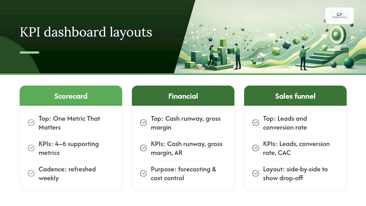
Three layouts cover most small businesses. A one-page executive scorecard puts your One Metric That Matters at the top, with 4 to 6 supporting KPIs below it, refreshed weekly. A financial-focused dashboard centers on cash runway, gross margin, and accounts receivable, similar to the finance dashboard examples Qlik publishes for exploring forecasting and cost control. A sales and marketing funnel view tracks leads, conversion rate, and CAC side by side to show where prospects drop off.
For free starting points, Looker Studio's template gallery has small-business report templates you can connect directly to Google Sheets or your ad accounts. Databox and Klipfolio both offer free KPI packs tailored to specific industries, which save you the blank-page problem entirely.
When customizing any template, cut it down rather than adding to it. The two most common traps are cramming in too many KPIs and leaving time anchors unlabeled, so nobody knows if "revenue" means this week, this month, or year to date.
What Design Choices Make a Dashboard Actually Useful?
A dashboard with 20 metrics on it gets ignored within a week. Cap your headline view at 4 to 7 KPIs, and give every number a consistent anchor, prior week, prior month, or a stated target, so a reader knows instantly whether $12,400 is good or bad.
Pair each headline number with a trend visual: a sparkline plus a percentage delta tells you more in half a second than a raw total ever will. Presenting numbers in context lets the reader act quickly instead of hunting for meaning.
- Use color and arrows sparingly, red and green for status, not decoration.
- Choose readable fonts and design for a phone screen first; most owners check dashboards between meetings, not at a desk.
- Use tables for detail-heavy comparisons and charts for trends over time.
- Write a one-line definition for every KPI on the dashboard so nobody argues about what "gross margin" means.
- Avoid mixing daily operational detail into the same view as your headline scorecard. Keep them on separate tabs.
Which Systems Should Your Dashboard Connect To?
Most small businesses need the same handful of connectors: accounting (QuickBooks or Xero), payments (Stripe, Square, or PayPal), point-of-sale, a CRM, payroll, an e-commerce platform if applicable, bank feeds, and the occasional spreadsheet for anything with no API.
- Live API connections update automatically; CSV imports require someone to remember to upload them.
- Faster refresh isn't always better. Daily is plenty for most small-business decisions.
- Watch for data mapping mismatches, especially how a tool handles refunds, processing fees, and revenue recognition timing.
- Confirm encryption in transit, clear access controls, and a plain-language data handling policy before connecting your bank feed to any tool.
What Does a KPI Dashboard Cost and How Long Does Setup Take?
Your budget and your patience for setup usually point to the same answer. A free DIY build in Looker Studio takes hours to a few days if your data is already clean. Low-cost SaaS tools with built-in connectors run roughly $20 to $90 per month and take days to two weeks to configure properly. Mid-range platforms with deeper analytics run $90 to $300 per month. Fully managed or custom-built dashboards start around $1,500 in setup fees and take 2 to 8 weeks depending on how many systems need connecting.
Your actual timeline depends heavily on how many data sources you're connecting and how clean your books already are. A business with reconciled accounts moves through setup far faster than one that's been letting bank feeds pile up unreviewed.
How Was This Shortlist Chosen?
This roundup prioritizes small-business fit over enterprise depth: native connectors to common systems like QuickBooks and Stripe, realistic setup time for a non-analyst owner, transparent pricing, available templates, and straightforward day-to-day usability. It intentionally skips enterprise-only features and heavy analyst workflows that most small teams will never touch.
- Weighted toward tools with prebuilt small-business KPI packs.
- Weighted toward self-serve setup over consultant-required implementations.
- Adjust these criteria for your own industry. A restaurant weighs POS integration differently than a consulting firm weighs CRM depth.
When Should You DIY Your Dashboard vs. Hire a Partner?
DIY works well when your data is simple, your books are current, and you have a few hours monthly to maintain the dashboard yourself. Hiring a partner makes more sense once you're juggling multiple entities, chasing messy books, or growing fast enough that reconciliations eat your week. A full BI platform gives you deep customization, but it demands ongoing analyst time that most small teams don't have.
That's the gap Mygappro fills: remote bookkeeping that keeps your source data reconciled, paired with the reporting you need to actually run the business. If your books are the bottleneck, start with Mygappro's bookkeeping and tax services rather than buying another dashboard tool to sit on top of unreliable numbers. For owners further along, fractional CFO support often includes dashboard and KPI strategy as part of the engagement, and a consultant like Patricia Barrios can help with the broader financial planning question of which metrics matter for your specific goals.
Sources
- What Is a KPI Dashboard | Microsoft Power BI
- Financial dashboard examples | Qlik
- Small Business KPIs: What Are the Numbers That Matter? | CO- by US Chamber of Commerce
- What Is a KPI Dashboard? Best Practices & Examples | Tableau
- 8 Best Small Business KPI Dashboards to Stay on Track ... | Databox
FAQ
What Are Examples of Good KPI Dashboards?
A good example is a one-page scorecard showing cash runway, gross margin, and weekly revenue with a trend line and comparison to last month, rather than a cluttered screen of raw totals with no context.
How Do I Create a KPI Dashboard?
Pick 4 to 7 KPIs tied to your business stage, connect your accounting and payments systems directly, set a comparison anchor for each number, and validate one full month of data before trusting it.
Where Can I Find a Free KPI Dashboard Template?
Google Looker Studio's template gallery offers free small-business report templates, and tools like Databox and Klipfolio publish free KPI packs built around common small-business metrics.
What Is a KPI in a Dashboard?
A KPI, or key performance indicator, is a specific number tied to a business objective, like gross margin or customer acquisition cost, that a dashboard displays alongside a trend and comparison point so you can act on it quickly.